Hong Kong Exchange and Clearing Limited (HKEx) operates a securities market and a derivatives market in Hong Kong, along with the clearing houses for those markets. HKEx was listed in Hong Kong in 2000 and is now one of the world’s largest exchange owners based on the market capitalization of its shares.
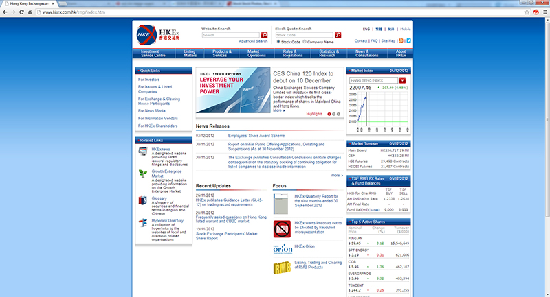
We provided product branding services for HKEx to launch the Stock Options project by delivering a whole set of image designs applicable on different platforms, as well as guidelines to ensure the consistency of the product’s various presences. HKEx’s objective was to educate customers on the way to use derivatives. The challenge of the task was that while the product must exhibit professionalism and reliability, it must not look rigid. It must be presented as a product of HKEx, and it has to be able to symbolize the product itself as well.
We embarked on a large amount of research on financial derivatives and started experimenting with different design approaches. The finalized design concept manifests the essence of stock options. It projects the “long call” strategy – the simplest and most popular basic strategy from the options into 3D perspective. The blue plane signifies the “underlying” stock on which the long call graph is based, and is skewed into perspective to imply “derivative”. The perspective also emphasizes the time dimension characteristic of stock options, which is further elaborated by the fade-out effect towards the end of the graph to symbolize the time erosion of the option value. The color tones bear a resemblance to the HKEx logo, while the smooth transition of color and the transparent effect exudes freshness, smartness and modernity. We also delivered different variations of the product image applicable in other platforms, say company documents, campaigns, social media and so forth. While adding some twists based on the design concept, the overall presence of the product image remains poised and consistent.
PROJECT DETAILS
DATE: 2012
CLIENT: Hong Kong Exchange and Clearing Limited